How Too Many Product Options Can Stop Your Customers From Making A Purchase (Paradox of Choice)
What is the Paradox of Choice and How Does it Impact E-commerce Websites?
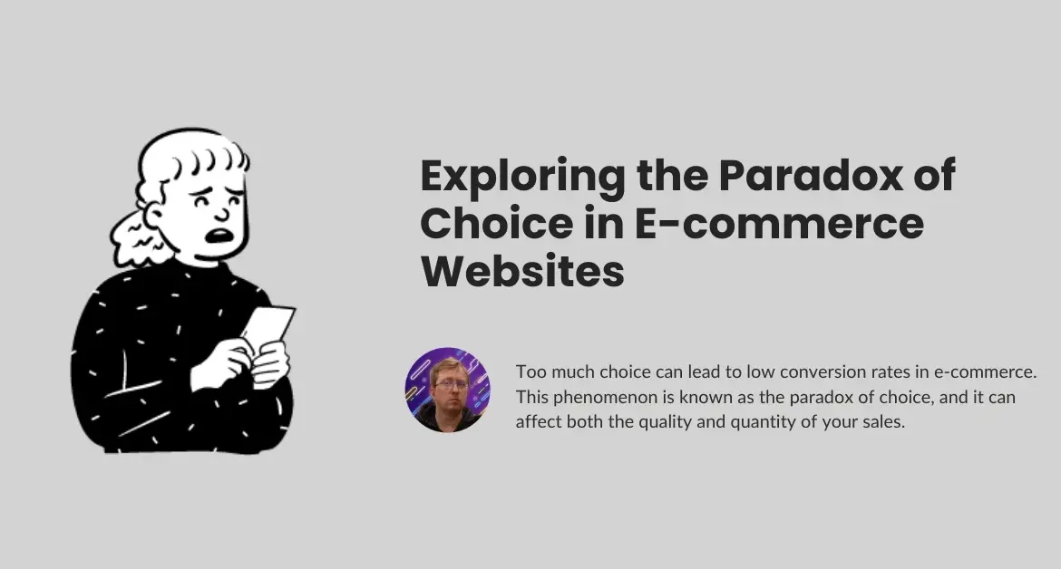
The paradox of choice is the idea that having too many options can lead to indecision, anxiety, and ultimately unhappiness. This is because when people are faced with an abundance of choices, they may feel overwhelmed and unsure about which option is the best. As a result, they may feel anxious about making the wrong decision and may even avoid making it altogether. The paradox of choice can also lead to regret, as people may second-guess their decisions and wonder if they made the right choice.
Too many choices can lead to decision fatigue and low conversion rates, especially regarding online shopping. Consumers are overwhelmed by the sheer number of options available, leading them to suffer from choice overload or shopping fatigue.
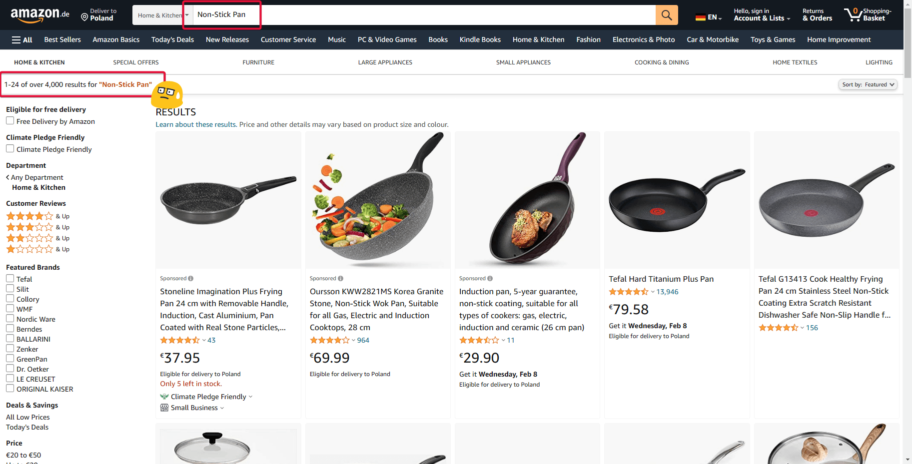
Amazon is a good example of the Paradox of Choice as it has millions of products

How to Reduce Choice Paralysis on your E-commerce Website
- Make the website easy to navigate.
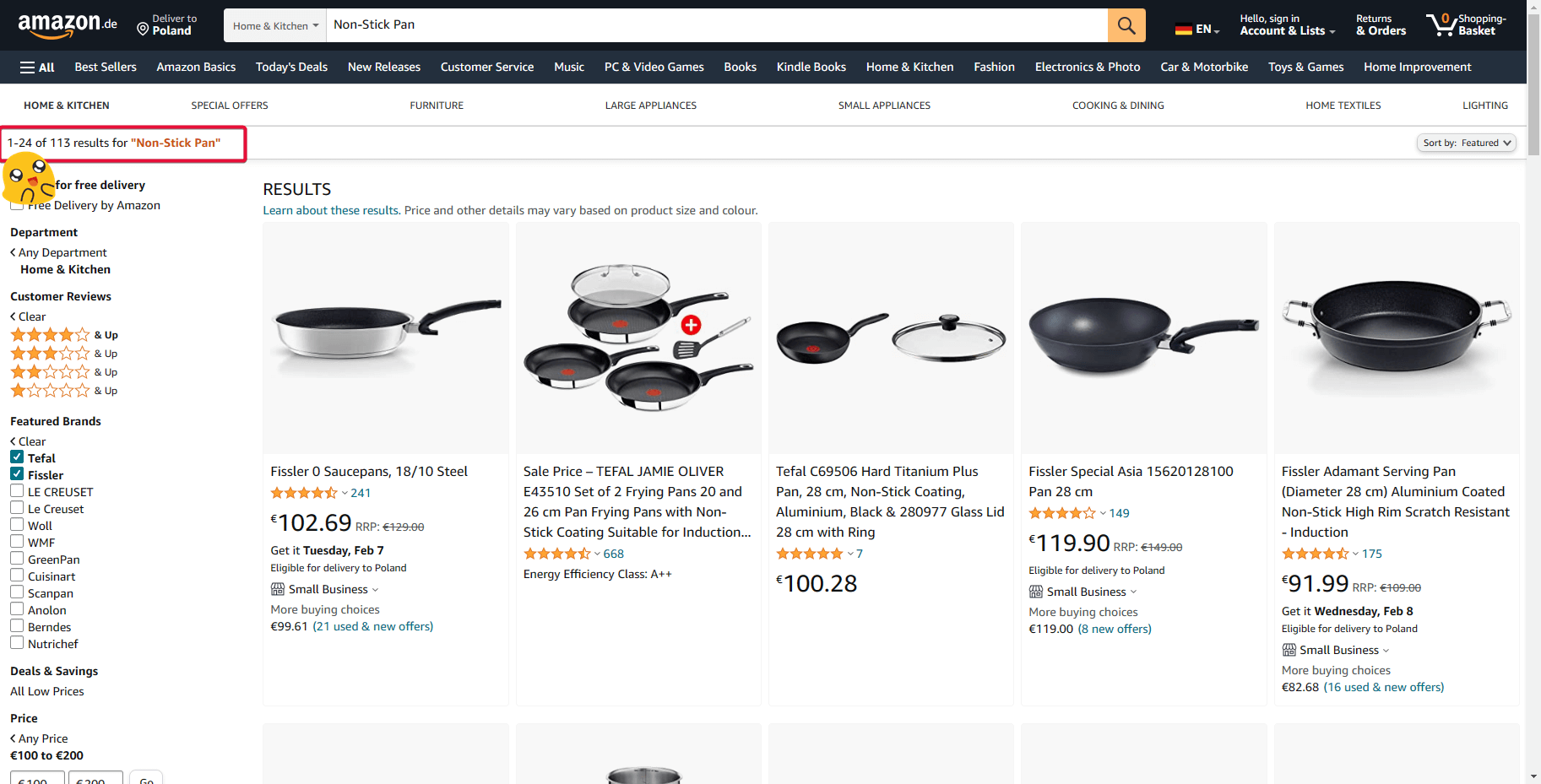
- Create Filters
- Create sub-category { if you see too many options }
- Make recommendation {something like “Top 3 Non-Stick Pan” }
This will reduce the stress that customers have when searching for a product

A/B Testing: Your Key to Removing Choice Paralysis and Boosting Conversion Rates
Unlocking the Power of A/B Testing: A/B testing is like a magic wand for e-commerce websites, especially when it comes to defeating the Paradox of Choice. This smart strategy allows websites to try different tricks and tweaks to find what makes customers happy and ready to click that “Buy” button.
Breaking Down the Paradox:
- Solving the Too-Many-Options Puzzle: A/B testing helps crack the code of presenting products. Websites can test different layouts, filter options, and recommendation systems to discover the perfect combo that eases customers’ decision-making stress.
Turning Insights into Action:
- Tailored Experiments: Imagine a shoe store testing two ways to display shoes. One shows all shoes at once; the other sorts them by type. A/B testing helps reveal which version makes customers more likely to choose, breaking the chains of choice paralysis.
How A/B Testing Works Against Choice Overload:
- Simplifying Layouts: Test different website layouts to find the one that guides customers smoothly without overwhelming them.
- Filtering Confidence: Experiment with filter options to help customers quickly narrow down choices, making the decision process feel less daunting.
- Fine-Tuning Recommendations: Adjust recommendation algorithms to offer personalized suggestions, reducing the anxiety of choosing from a vast array of options.
Results You Can See:
- Conversion Rate Boost: A/B testing isn’t just a fancy tool; it’s a conversion booster. When websites find the winning combination, customers feel more at ease, resulting in more purchases and higher conversion rates.
Practical Tips for E-commerce Success:
- Start Small, Win Big: Begin with one change at a time. Small tweaks can lead to significant improvements without confusing the overall picture.
- Data Speaks Louder: Listen to the numbers. If one version brings in more sales, that’s your golden ticket to reducing choice paralysis and winning over customers.
A/B testing isn’t just a tool—it’s the secret sauce that transforms choice overload into a seamless shopping experience, driving higher conversion rates and making your e-commerce website a customer’s preferred destination.
⚡ Digital Marketing Strategies for Small Businesses — Digital marketing can be a game-changer for small businesses. With the right approach, they can build a strong online presence, reach their target audience, and compete effectively—even with limited budgets. This article will explore essential digital marketing strategies that can help small businesses succeed.
The Benefits of Reducing Choices on Your Site & How this Contributes to Higher Conversions
By reducing the number of choices available to customers on your site, you can create a better user experience. With fewer options, customers are more likely to make a decision quickly and easily, leading to higher conversion rates.
The Dark Side of Freedom of Choice (The Paradox of Choice)🎁
FAQ
How to Reduce Paradox of Choice on your E-commerce Website
- Make the website easy to navigate.
- Create Filters
- Create sub-category { if you see too many options }
- Make recommendation {something like “Top 3 Non-Stick Pan” }
